Brand specific styling
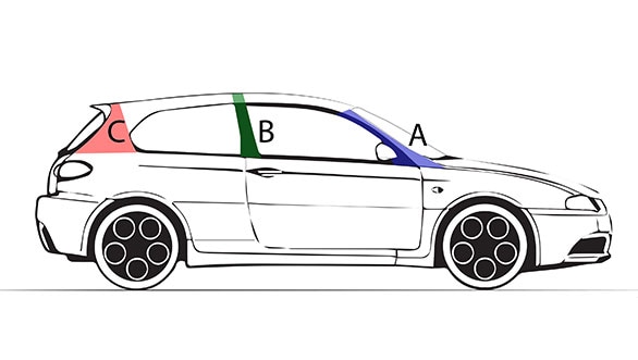
Recently I drove the Maruti Suzuki Ignis. The moment I got behind the wheel, it was an instant connect and I was enjoying driving it. After a while I pulled over to take a closer look at my driving environment. What was making driving this car so easy? I studied the interior and my driving position minutely. I looked in all directions and then I had the 'eureka moment'. I could see a lot more clearly than in most other vehicles, especially other hatchbacks. Yes, the visibility in the Maruti Suzuki Ignis is indeed very good, but why? It's because of the more upright A-pillars which don't hamper visibility, particularly around curves.

These days most cars have a 'cab-forward' design. This simply means moving the passenger compartment of a vehicle forward and extending the windshield over the front wheels. Look at cars from the '80s and earlier. You can touch the windscreen while sitting in the seats. Now in many cars, the dashboard is deep, sometimes up to two feet! Look under the bonnet and you might see the engine also going a fair bit under the windscreen. Yes, in a 'cab-forward' design, the interior is literally 'stretched' to provide more space.
While the Ignis also has a bit of a 'cab-forward' design, you still sit closer to the windscreen than in many other cars. The windscreen is also not sloped sharply because of the Ignis's boxy styling, which makes it look distinctive. We are now living in a period where cars are looking more alike than ever, but the Ignis fortunately stands out. In fact, it not only looks different from other hatches, but its profile and styling also have little in common with other Maruti vehicles. Of course, the rear-end design is deliberately inspired by the Suzuki Cervo, to give the Ignis a bit of 'retro character' too.
Personally, I quite like the way the Ignis is styled, but what I think is even more important is that Maruti Suzuki have the freedom to do distinctive designs for their vehicles. Yes, look around and you will notice that these days most car companies have a common company look or front end that is universal to all their products. Some designers I have spoken to have said that it's important for car brands to maintain some "facial continuity" for the purposes of recognition and awareness. Manufacturers like Rolls-Royce, BMW and Mercedes-Benz have done this for the longest time. Their front grilles, lights, shapes etc. have evolved and got modernised, but they have preserved and kept intact their essential brand identities. And thanks to this, their vehicles are recognised instantly, which I am sure is good for the brand.
Even mass manufacturers like Hyundai are now beginning to have a common brand face and familiar look for all their products. But maybe some manufactures like Audi, BMW and Mercedes are taking this too far. Their cars now all look the same, be it a BMW 3 Series, or 5 or 7 Series. You cannot tell them apart until you look really closely. I am certain the owner of an Audi A8 does not want it to be mistaken for an A6, or worse an A4. So clearly, there is a dilemma here â€" how similar should cars of the same brand look? I believe each model should have its own look and character. Yes, some things can be common â€" case in point being the Maruti Swift and Ciaz. Both don't have much in common in their styling, but both have Suzuki's emblem positioned prominently on the grille.
In my view, manufacturers like Maruti Suzuki who don't have a common brand design are better placed to do more distinctive vehicles. They also have the freedom to tailor-make a design to fit the specific requirements of a product. And that's why they could go for a boxy design with the Ignis, which is completely different to, let's say, the Maruti Baleno. Both are hatches, but that's about the only thing common in their looks and styling. Of course, some will argue that it's better for the brand image if you have a common look. But Maruti is doing extremely well even without this.
As an enthusiast, it pains me that even iconic brands like Range Rover and Land Rover have given up their characteristic and distinguishing styling and gone in for a look familiar to all Land Rover products. Time was when you could make out a Range Rover and a Land Rover from a mile away. The Range Rover was known for its straight lines and boxy profile. The windscreen was upright and they always had a huge glasshouse that provided passengers very good all-round visibility and an airiness that ensured you never ever felt cramped in a Range Rover. But after the success of the Evoque, which I must say is a path-breaking design that will go down in history books as one of the best-styled vehicles ever; every Land Rover vehicle is now beginning to sport the Evoque's design elements. To such an extent that the Range Rover Sport now has a sloping roof and a rising beltline!
Just like real characters in our public and everyday life are disappearing, cars with individuality are also becoming rare. Of course, some of this is because of safety requirements, aerodynamics etc. but a lot also has to do with the brand's approach to its image.