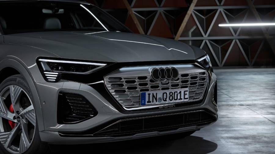
Audi's '4-ring' logo gets a stylish update
Audi has unveiled its new logo, which replaces the three-dimensional chrome appearance of the "rings" with a more subdued monochromatic identity.

The new logo has a beautiful three-dimensional look because it is completed in white with a black outline. In reality, the German automaker claims that they have discovered a new chrome with this appearance.
With the dark grey finish replacing the white, Audi has you covered. Audi has experimented with more than simply its logo. Future Audi premium vehicles will all use the "Audi Type," a standardized typeface style. The upscale brand claims that the fundamental tone is noticeably more subdued without sacrificing individuality or quality.
Audi designer André Georgi explained: "Today's chrome rings stand for high quality. The material alone conveys that message. But we believe that we have found the 'new chrome'. The clarity of the new black-and-white rings makes our corporate identity unmistakable. The thin black border around the rings makes for a consistent, premium-quality appearance, regardless of the car's paint or radiator-grille colour."
Also Read:
Audi Q8 e-tron makes global debut
Starts Rs 1.34 Crore
2995cc
Automatic
340
500
-NA-


