In pictures: the 2012 and 2013 Mercedes E-Class compared
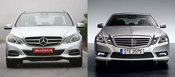 The 2014 Mercedes E-Class has the three-pointed star front-and-centre. A first for the E.
The new 2014 Mercedes E-Class is here and we've already brought you an exclusive first drive that you can read here. However those of you wondering just how visually different the latest car is from the old version will find this comparison rather informative
The front end is the area that sees the most change. The eye is the sleek new headlamps that ditch the old car's signature four lamp set up that debuted in the W210 generation. However Mercedes have made smart use of LED arrangement to keep the four eye theme going. This is the first Mercedes to offer full LED headlamps and the day time running lamps are also replaced by LEDS in the main headlamp unit. The new grille pronouncedly protrudes as seen in most new Mercs like the A-Class, SLS AMG and the CLS-Class. The bumper is also all-new and features a more contemporary and swoopy design. Overall the E-Class looks much younger with a new sporty flair but it does lose out on some elegance. Case in point being the bonnet mounted old school three-point star logo that has now been moved to the grille.
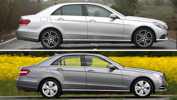 The 2014 model E-Class strikes a sportier stance than it's older brother
The side profile is the most familiar angle on the car but there are some small changes. The previous W212 generation gained a flare at the rear haunch that was inspired by the old Ponton Mercs from the fifties and sixties. Mercedes has chosen to tone down this flare on the new car and it's a much smoother looking surface now. The wheel arches and lines across the side are otherwise the same.
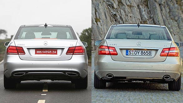 Sporting ambitions evident in the rear as well, with new trapezoidal twin exhausts
Like the front the big change at the rear lies in the lamps. These new LED tail lamps are well executed with some beautiful details that become apparent at night. While the overall shape of the lamps is similar the new ones give the rear much more character. The new car also gets a fresh bumper.
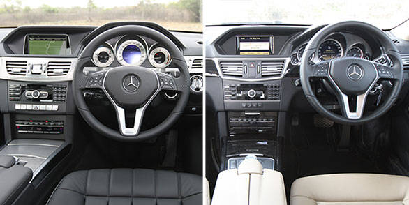 Interiors have received an update for 2013, while remaining familiar
Changes to the interior aren't clear at the first look but Mercedes has made a few of them. For example the clock has been moved out of the instrument cluster and is now on the dashboard. The centre console also gets a few more buttons that are finished in metal for that classy feel. The COMAND interface now benefits from a larger screen with an improved UI and standard navigation for India. The instrument cluster now has three pods as against the earlier five. While the new car shows a metal finish a wood trim like on the old car is also available but we feel that the metal finish and all black interior better complements the sportier exterior. We also found the new seats were even comfortable
While the changes may not be drastic Mercedes has definitely given the E-Class a thorough makeover and the result is that the car feels younger and fresher than ever before.
Starts Rs 63.6 Lakhs
2100cc
Automatic
197
500
14.2 Kmpl


